Images make websites visually appealing, but if not optimised correctly, they can slow down your site, hurt user experience, and reduce your search rankings. In this guide, we’ll cover everything you need to know to make Google happy while ensuring your WordPress images shine.
| Format | Best Use Case | Pros | Cons |
|---|---|---|---|
| JPEG / JPG | Photos, detailed images | Good quality, smaller file size | Not transparent |
| PNG | Graphics, logos, icons | Supports transparency, high quality | Larger file size |
| WebP | Any web image | Superior compression, supports transparency | Not fully supported on older browsers |
| SVG | Logos, icons | Scalable, lightweight | Not for photos, requires clean code |
Tip: WordPress now supports WebP natively. Always use next-gen formats when possible.
When optimising images for your website, it’s important to match them to their container size. A container is the area on a page where the image will be displayed, like a full-width hero banner, a sidebar, or a content area. Using images larger than their container slows down your site, while smaller images may look blurry. You can find the container size by inspecting your page with your browser’s developer tools or checking your theme’s layout settings.
| Device / Container | Recommended Width | Notes |
|---|---|---|
| Full-width desktop hero banner | 1920px max | Resize to actual display width; compress for speed |
| Content area (desktop) | 800–1200px | Scale appropriately for article content |
| Sidebar / widgets | 300–400px | Smaller images improve load time |
| Mobile screens | 480–800px | Use srcset for responsive images |
| Thumbnails / previews | 150–400px | Compress aggressively, keep readable |
WordPress automatically generates multiple sizes (thumbnail, medium, large). Ensure your theme uses responsive images via srcset.
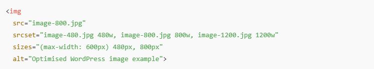
Responsive images ensure the correct size is served to each device:
Optimising WordPress images is more than just compression. You need to consider device sizes, containers, responsive behaviour, and high-DPI screens. When done right, your website will load faster, rank better, and provide a superior user experience.
Pro Tip: This is something I can handle as part of a WordPress Maintenance & SEO Optimisation Package – ensuring every image on your site is Google- and user-friendly.